Showing posts with label Invisible Cities. Show all posts
Showing posts with label Invisible Cities. Show all posts
Friday, 23 October 2015

Thursday, 22 October 2015


Lower Exterior Finished Painting


 |
| After a suggestion to change the way the bars looked, I moved them back behind the water layer. I add the bars to a few of my over thumbnails and colour compositions as a way to express the separation of water, getting the idea by studying a marble run. |


Monday, 19 October 2015
Esmeralda Interior Colour Comps

Here I try and give the colour scheme a bit more warmth, but still reference the water in the interiors of the city. I also gave a little more thought to the sewers and what the mood and lighting would be in them. I thought about a turbine room, baths, what would heat the water and pipes.
Thursday, 15 October 2015
Esmeralda: Collages and Colour Compositions


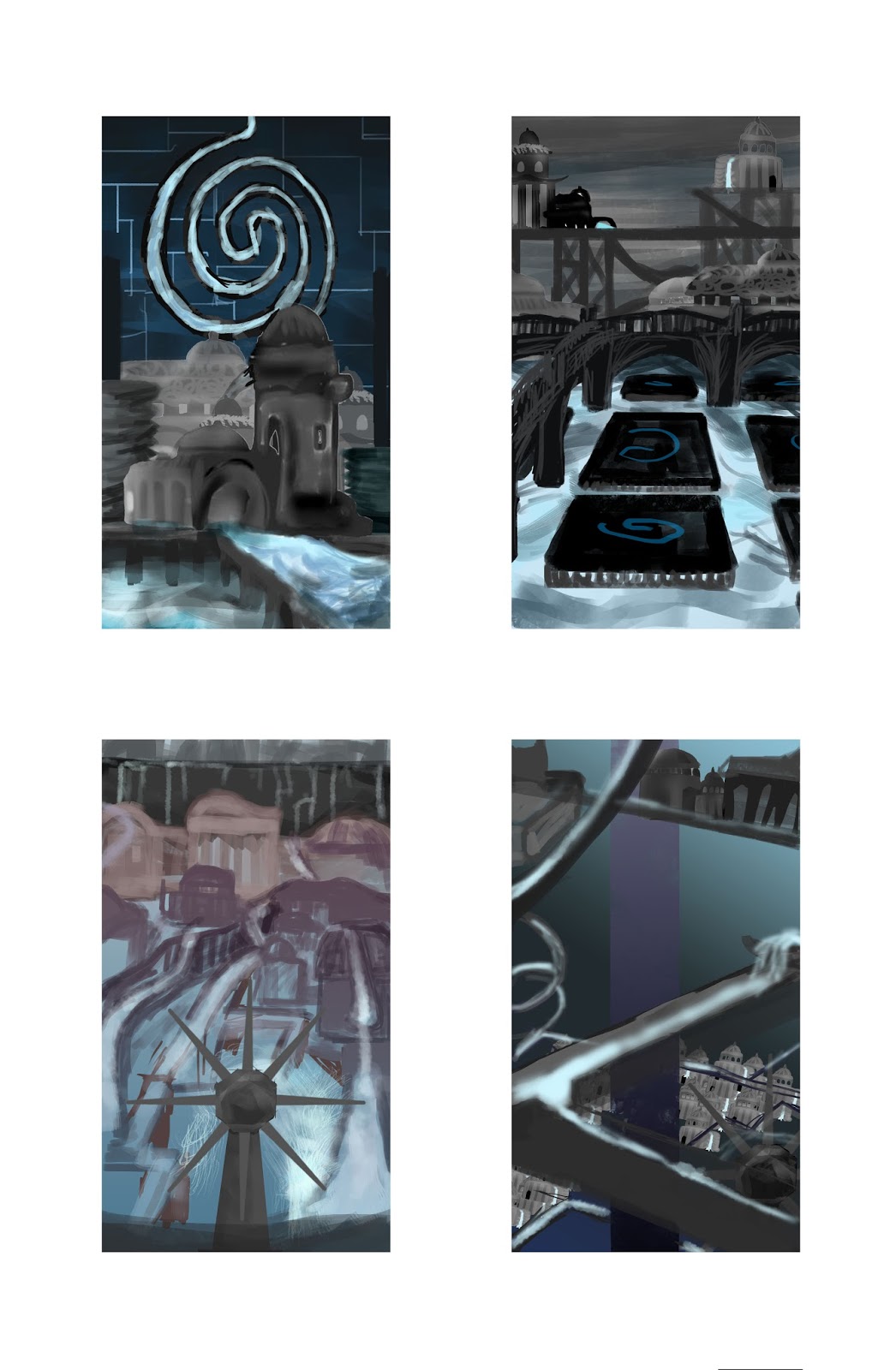
To get a sense of how the whole of the city is composed, the quick collages, made up of the houses and buildings from my buildings exercise, are really useful in getting around to my master shot, understanding the dimensions around the city. I tried out a few different design elements, settling with a few motifs if I liked their importance to the city. For Esmeralda, I wanted to show how the directions of the water is changed and how the citizens live and rely on it. Because of the many different travel routes and pathways, I wanted the city to be maze-like and mysterious in it's connection to the constant changing water, as well as a chaotic city life, whist still retaining a sense of calm.
I tended to use my buildings sparingly after a got more sense what the city looked like, as I wanted more of the waterways making up the city. It hard not to make the whole thing look over-loaded, so I added walls just to separate parts and place settings in a higher tier. I also tried to think about perspective and the composition of symmetry and what parts of the image to focus on, after learning about the rule of thirds and how to compose an image.
Another thing that was important in the composition is the colour, as it can effect the mood and the way the audience views the city. I wanted the city to be atmospheric and have constant shadow, but impressive and not too grim. I found that having just lighter blue and dark contrast was too flat, so I tried a few more colours to add more light and warmth as it looked too cold. What seemed to work was to give it a bright colour and a glow, but with some shadow and a touch more of the purple red colour. The grey shading on the buildings is less appealing.
Wednesday, 7 October 2015
Tuesday, 6 October 2015
Concept Art- Sketchbook Thumbnails 92-105
 |
| 92- Zirma, 93- Zirma, 94- Diomira, 95- Argia, 96- Isaura, 97- Sophronia, 98- Armilla, 99- Sophronia, 100- Isaura, 101-Isaura, 102- Phyllis, 103- Diomira, 104- Isaura, 105- Armilla |
Here I have have a hand in drawing some cities that I hadn't yet drawn. Most were just to get a feel of the city and to relate it closely to the text, though for the building designs of Isaura, I feel like I have followed the text loosely, as based on the design of a city built above a lake, I tried to give it a subterranean feel, basing the houses instead on fishing nets and subterranean life like the Blobfish, rather then focusing on the wells of the city.
Monday, 5 October 2015
Isaura Digital Thumbnails 72-81

Isaura was a challenge to draw, perhaps more than the given cities which weren't described as clearly as others. The concept of Isaura was fairly clear, that it is built above a subterranean lake. What was difficult for me the design of wells, being clunky and fitting well for the fluid outline of city I wanted to go for, being a city over a lake, some design would be taken from the lake. For the inclusion of the ideas of religion brought up in the text, I added the idea of the statues of lake spirits holding buckets for an interior shot. I also wanted to make a unique design for the houses, which are like fishing nets and blob-like, after the iconic subterranean fish, the Blobfish.

Thekla Digital Thumbnails 62-71

Thekla is the city constantly under construction and as with some of the other cities of this nature, I couldn't help getting some inspiration of some kind from the Tower of Babel myth, as a tower being built constantly and wanting to reach the stars at the cost of back-breaking work. To have city being build every day but never finished would be such a daring project that it takes into account Human arrogance for creating impressive feats of manpower. Something that worked with this idea is to make the construction look like fingers pointing up. I put more emphasis in the background surrounding area of the city than others, as something from the text stood out to me as the night sky being a part of the city.

Zirma Digital Thumbnails 51-61

In terms of cities, Zirma was one of the more difficult to visualise due to it's less descriptive text in Zirma's passage in Invisible Cities. Rather than having a design theme written, the whole city has a mood, which stems from the city's apparent insanity. What I wanted was to create different moods or design elements of the city, depending on how I feel about certain parts of the text I read. At times, it is whimsical, and the brush I use or the colour is used in that way. Other times it is abstract or bleak. Some design of the buildings are meant to be jagged skyscrapers, but others stem from more bizarre imagery like an eye or the interior of a building that is like a womb, and quite disturbing.

Wednesday, 30 September 2015
Abstract Exercise, Thumbnails 35-50
 |
| 35- Baucis, 36- Baucis, 37- Armilla, 38- Baucis, 39- Armilla, 40- Armilla |
 |
| 41- Baucis, 42- Baucis, 43, Zirma, 44- Zirma, 45- Anastasia, 46- Moriana |
 |
| 47- Baucis, 48- Armilla, 49- Baucis, 50- Anastasia |
Painting freely, and not having to worry about tone, form, or substance was interesting and it gave me a lot of ideas for digital thumbnails, which I am still getting the hang of. I found myself not looking at which brush I was using, but just picking one that looked the best for a mood I was trying to convey in each thumbnail.
The cities I pick for this exercise were Armilla, Esmerelda, Baucis, Zirma and Moriana. In this session, I was introduced to a way of working and picking out themes and symbols to draw by Word Stacking, picking out random words of the text and writing down whatever springs to mind. This way I'm not just drawing the whole city, just a theme or motif of the city to separate it from others with similar ideas to it, like the Spider Web cities, Octavia and Ersilia.
When using the marque tool and manipulating the pictures by colour or warping, I tried to do it with a clear purpose, to elongate them if they are described as thin cities, to give them a clear thematic design to fit in with the personality of the city. For example, I gave Zirma a very jagged, warped and fairly eye-popping contrasting colours as the city is described as maddening or insane.
Monday, 28 September 2015
Digital Thumbnails pages 1 and 2
 |
| 17- Baucis, 18- Argia, 19, Ersilia, 20- Baucis, 21- Baucis, 22- Moriana, 23- Despina, 24- Tamara, 25- Tamara |
 |
| 26- Tamara 27- Phyllis, 28- Zirma, 29-Argia, 30- Zenobia, 31- Despina, 32- Leonia, 33- Moriana, 34- Fedora |
Sunday, 27 September 2015
Concept Art- Sketchbook Thumbnails
 |
| 01- Argia, 02- Ersilia, 03- Armilla, 04- Baucis, 05- Octavia, 06- Despina, 07- Despina (Interior), 08- Octavia |
 |
| 09- Anastasia, 10- Tamara, 11- Anastasia, 12- Esmeralda, 13-Esmeralda, 14- Armilla, 15- Sophronia, 16- Armilla |
Wednesday, 23 September 2015
Influence Map 1 for Invisible Cities
 |
| The Tower of Babel (top left), Minas Tirith digital painting (top right), Minas Tirith concept painting by Alan Lee (left), spider webs by tent web spiders (middle), drawing of Venice by Ruby Lane (right), chunk of onyx (below left), Minas Tirith concept painting by John Howe (below middle), columns from a Roman Bath House (below right), Shelob's tunnel concept painting by John Howe (bottom left), Stairs to Cirith Ungol concept drawing by John Howe (bottom right), Ladder painting by Charlie Brouwer (far bottom right) |
As a Lord of the Rings fan, I'm familiar and a fan of Alan Lee and John Howe's concept art for the films and illustrations for the books. The city of Minas Tirith is one city to look at for influences for the Invisible Cities brief, as it was in a part inspired by a Medieval Venice, but also Mont Saint-Michel in France. There is something about the design that fits the description of the city Diomira in Calvino's anthology of Invisible Cities. I tried to find images for different aspects of Venice and different moods and tones. The canal is described in a number of Calvino's cities and I'm looking for designs which show the architecture either flowing and subtle or tight, narrow and stylized.
I wanted to find and express a desire to research the various different aspect of the cities that make them unique rather than the city itself so I went back to John Howes illustrations of Shelob's tunnel for a reference to the city of Argia; the stony city. The description of dampness and the harsh environment destroying bodies and long dark tunnels reminded me vividly of the description of Shelob's evil venom and malice eroding away rock and slinging her giant body to form tunnels, creating harsh, jagged rocks.
Looking at Anastasia and Armilla, which have major connection to water and bathing designs, I thought about Roman Baths and pillars. For Armilla, it would be more in decay and abandoned, which is the contemporary look at the baths. I included the chunk of onyx as it may be useful to go into the detail of the geology that makes up the city and trade that goes in, especially for Anastasia.
I found a few spider webs to fit the description of Ersilia and Octavia, looking for denser, heavier webs that could support a city, and thought about where the webs could be supported from. The ladders helped think about dramatic perspectives for shots of cities, like Baucis, Thekla and Zenobia, which have imagery to do with structures and construction, being stilted and tall.
This will help as an early board of reference to ideas that arise from the project. I more influences I want to share, so this is a starting point of what I want to come across with my thumbnails and sketches.
Subscribe to:
Posts (Atom)