A look into my design processes as I work along in my course as a CAA student at UCA Rochester.
Showing posts with label Digital Thumbnails. Show all posts
Monday, 13 March 2017
Fantastic Voyage: Initial idea thumbnails
Starting with a simple cave tunnel aesthetic, with making distance easier to see, it gave me a few ideas to later work it into a 2D cut-out design.
Friday, 13 January 2017
Like For Like Storyboard part 1: The Lego Movie (2014)
I am currently working on drawing up the Like-For-Like storyboard in preparation for my own storyboard for the storytelling and commission project. I chose this scene from the Lego Movie, directed by Phil Lord and Christopher Miller (2014), as the action is directed in various camera moves and the coverage of each camera is different. I haven't quite finished storyboarding the frames, so I thought I'd post this to keep my blog regular with my work. When I finish, I'll put all the pages together with descriptions of the camera movements.
Sunday, 24 April 2016
Fantastic Voyage: Development for Cell Cityscape
Thursday, 17 March 2016
Fantastic Voyage: The Pin board and the map
This concept art for the detective's pin board is what I'll be using as a framing device in my animation project. Each branch represents a different area of topic about the zika virus, which are: how the virus spreads through Human cells, symptoms of the virus (including the topic of birth defects), the spread of the virus worldwide and how the body fights the virus.
This is a quick, early stage animation I made for the pitch, as part of a showcase of which countries are now affected. A narrator will explain where the virus had been tracked to and where the different strands and mutations of it are located, wondering where it will next be located.
Fantastic Voyage: Character Design
This is character design work for the Zika virus. I was primarily testing out a prohibition-era Gangster design for the cell. Its RNA strand produces more Zika Gangsters which combine to take down the city. Following some advice from Jordan, I also tried a more ambiguous design route, to convey the idea that the Zika Virus is still being researched and parts are still unknown.
Friday, 11 March 2016
Fantastic Voyage: Environment Development
Taken from my sketchbook work, I've been experimenting with the cell designs and mixing it in with my cityscape idea.
Tuesday, 8 March 2016
Fastastic Voyage: Environment Design 1
Wednesday, 2 March 2016
Wednesday, 24 February 2016
Sunday, 14 February 2016
From Script to Screen: Concept Art Interior + Environment
![]() |
| Haunted House exterior environment |
The house was influenced and comprised of different elements of the Amityville Horror house and the main houses from 'Psycho' and 'Fight Club', because of their connection to Gothic design, though I didn't want it to be too over the top. I was struggling with making it look abandoned, as I felt that it wouldn't make sense in the narrative if a Burglar broke into obviously broken and abandoned house, so I tried to go for the look of a house abandoned and forgotten on the edge of suburbia for around 6 months. The grass has over-grown a little and creeping vines have started to grow.
![]() |
| House interior hallway (colour pass) |
![]() |
| House interior hallway |
This concept is taken from shot 7 of my storyboard for a full look at the hallway. I used references to 'The Shining' and 'Psycho' to add the tone of it being a recognisable to the audience that this is a horror house. The colour of red and blue was what I picked up on in 'Black Narcissus', being a psychedelic clash. What I thought of as two opposing forces meet in the house, as the cold burglar representing blue and the temperamental ghost who I saw in design as almost like a frozen sparkler being the red opposition.
Wednesday, 27 January 2016
Flash Character Animation: Exhausted Squash Storyboard and Environment
Friday, 22 January 2016
Monday, 7 December 2015
What If? Metropolis: Better concept art?
I've been working on improving my concept art for my scene. There still needs to be changes to this, but it has better understanding of perspective then my previous one. I used the textures I've been working on to add to the buildings. I've added the key objects I want it my scene this time, but I still think it's a little cluttered, so any input would be welcome on how to improve it.
Thursday, 19 November 2015
Saturday, 14 November 2015
Wednesday, 4 November 2015
Continued What If? Metropolis Thumbnails: Refining the egg
![]() |
| Thumbnails 31 and 32, an improved look at some of my digital designs for an egg based city, and a look at a simplified building for the lower class of the city. |
These thumbnails look into the egg design of the original Fabergé in order to see how they would look for the design of the Metropolis. I don't think it is necessary to create every building to be a perfect egg. One idea I liked that suited the egg design, however, was the idea of an automata-powered 'surprise' that would serve to be the interior or form a part of the city. Working digitally, helped with experimenting and picking out colour.
Monday, 19 October 2015
Esmeralda Interior Colour Comps
Here I try and give the colour scheme a bit more warmth, but still reference the water in the interiors of the city. I also gave a little more thought to the sewers and what the mood and lighting would be in them. I thought about a turbine room, baths, what would heat the water and pipes.
Thursday, 15 October 2015
Esmeralda: Collages and Colour Compositions
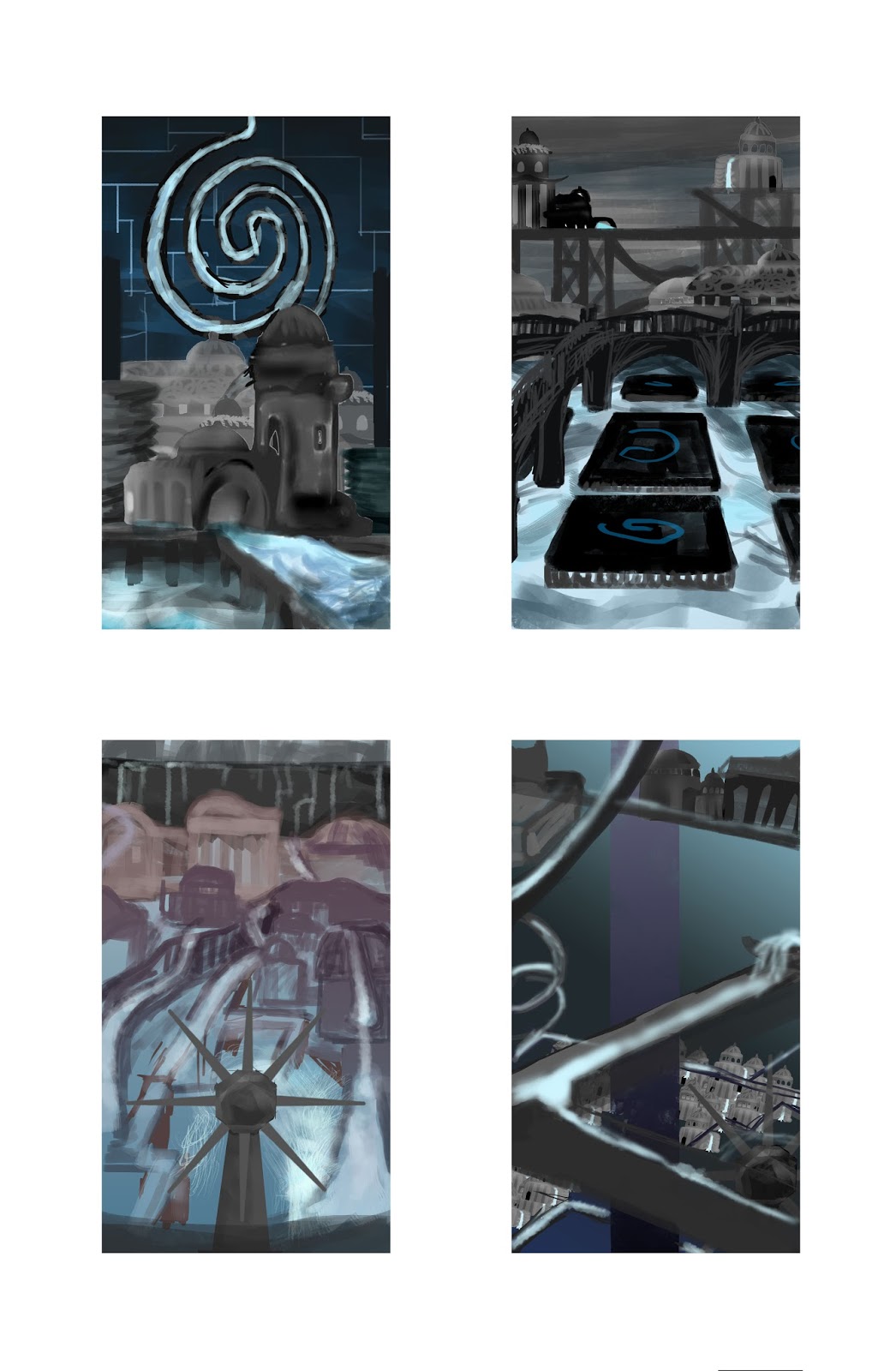
To get a sense of how the whole of the city is composed, the quick collages, made up of the houses and buildings from my buildings exercise, are really useful in getting around to my master shot, understanding the dimensions around the city. I tried out a few different design elements, settling with a few motifs if I liked their importance to the city. For Esmeralda, I wanted to show how the directions of the water is changed and how the citizens live and rely on it. Because of the many different travel routes and pathways, I wanted the city to be maze-like and mysterious in it's connection to the constant changing water, as well as a chaotic city life, whist still retaining a sense of calm.
I tended to use my buildings sparingly after a got more sense what the city looked like, as I wanted more of the waterways making up the city. It hard not to make the whole thing look over-loaded, so I added walls just to separate parts and place settings in a higher tier. I also tried to think about perspective and the composition of symmetry and what parts of the image to focus on, after learning about the rule of thirds and how to compose an image.
Another thing that was important in the composition is the colour, as it can effect the mood and the way the audience views the city. I wanted the city to be atmospheric and have constant shadow, but impressive and not too grim. I found that having just lighter blue and dark contrast was too flat, so I tried a few more colours to add more light and warmth as it looked too cold. What seemed to work was to give it a bright colour and a glow, but with some shadow and a touch more of the purple red colour. The grey shading on the buildings is less appealing.
Monday, 12 October 2015
Perspective exercises
The point system is good for understanding the dimensions of perspective, but it was difficult to figure out where to add a perspective line to create a realistic object. I learnt how to effectively paint straight lines and paint a gradient, which I'll be able to make use of for my perspective colour composition.
Subscribe to:
Comments (Atom)


