


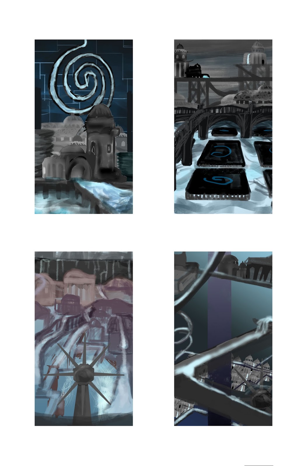
To get a sense of how the whole of the city is composed, the quick collages, made up of the houses and buildings from my buildings exercise, are really useful in getting around to my master shot, understanding the dimensions around the city. I tried out a few different design elements, settling with a few motifs if I liked their importance to the city. For Esmeralda, I wanted to show how the directions of the water is changed and how the citizens live and rely on it. Because of the many different travel routes and pathways, I wanted the city to be maze-like and mysterious in it's connection to the constant changing water, as well as a chaotic city life, whist still retaining a sense of calm.
I tended to use my buildings sparingly after a got more sense what the city looked like, as I wanted more of the waterways making up the city. It hard not to make the whole thing look over-loaded, so I added walls just to separate parts and place settings in a higher tier. I also tried to think about perspective and the composition of symmetry and what parts of the image to focus on, after learning about the rule of thirds and how to compose an image.
Another thing that was important in the composition is the colour, as it can effect the mood and the way the audience views the city. I wanted the city to be atmospheric and have constant shadow, but impressive and not too grim. I found that having just lighter blue and dark contrast was too flat, so I tried a few more colours to add more light and warmth as it looked too cold. What seemed to work was to give it a bright colour and a glow, but with some shadow and a touch more of the purple red colour. The grey shading on the buildings is less appealing.
Hi Zoe,
ReplyDeleteThese are some stunning thumbnails. They do a great job of conveying the complex network of channels throughout the city. I'm particularly fond of your portrait format experiments. The verticality feels as though it directs the viewer down from the top of the image to the bottom, much like cascading water. The asymmetrical composition of elements also gives some dynamism to your scenes.
As for your use of colour, obviously blue is going to be a fairly dominant colour throughout, however you'll need to be careful not to over use blues and sea greens. Otherwise you run the risk of making the city appear as though it's underwater (the gradient of light to dark in the sky of some of your thumbnails also makes it appear a bit Atlantean) However, if this is your intention, go for it!
Try experimenting with some more contrasting colours to alleviate this a bit. If you look at Venice, for example. The buildings above the water sport a fairly stark, light colour colour scheme that compliments the water below. The challenge is going to lie in finding a colour scheme that compliments the use of water and still conveys your intended atmosphere.